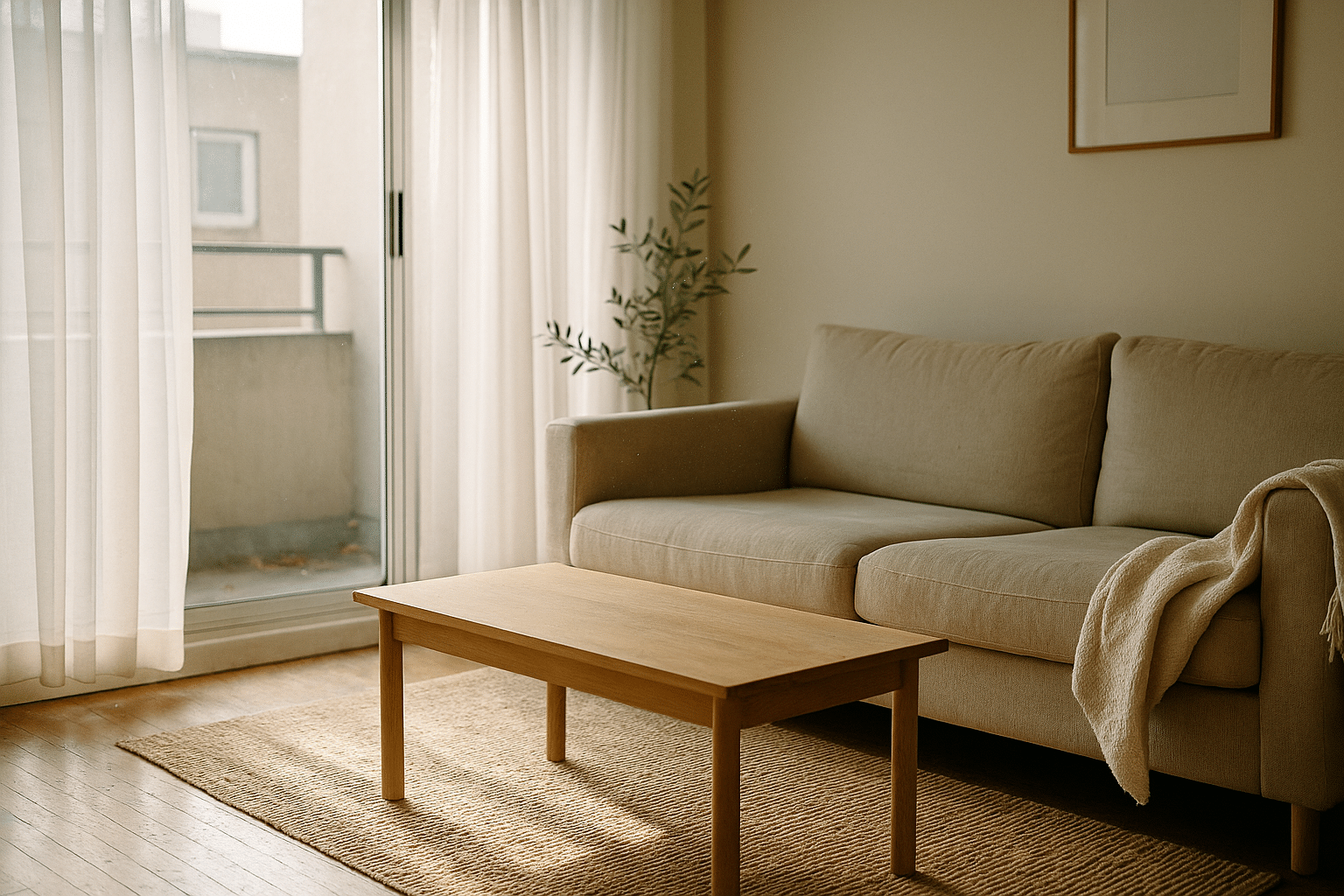
Apartment Staging Ideas to Attract Buyers and Renters: A Practical Guide
Outline:
– Section 1: Why staging matters for buyers and renters; the psychology of perception; digital-first decision-making; return on effort.
– Section 2: Decluttering strategies, space planning, and flow tailored to apartments of different sizes.
– Section 3: Color, lighting, and material choices that photograph well and impress in person.
– Section 4: Tailoring staging to audiences (buyers vs. renters) and layouts (studio, one-bedroom, family-sized).
– Section 5: Budget staging, measurement, and a final checklist with a concise conclusion.
Why Staging Matters: Psychology, ROI, and the Scroll‑Stopping Effect
Staging is less about decoration and more about decision-making. In a digital-first market, most prospects will meet your apartment through photos before they ever step inside. That means staging is a strategic communication tool: it clarifies scale, suggests lifestyle, and reduces cognitive friction. When rooms are clean-lined and purposefully arranged, the brain processes them faster, making it easier for viewers to imagine their own routines. This mental fluency translates into more clicks, more inquiries, and, often, quicker showings.
Industry surveys repeatedly note that staged spaces tend to attract stronger interest than unstaged ones, especially within the first week online. While results vary by location and price point, the pattern is consistent: clear, bright, well-composed rooms invite action. Staging also helps counter three common listing obstacles: uncertain scale (does the sofa fit?), poor light (is the living room dark?), and ambiguous function (is that corner wasted or a potential workspace?). By answering these questions visually, you turn hesitation into momentum.
For sellers, staging can influence perceived value, support firmer pricing, and shorten days on market by making the home feel move-in ready. For landlords, it can reduce vacancy by making the property look immediately livable and easy to maintain. A practical way to think about return on effort is to target high-impact zones first. Consider this priority order:
– Entry and living area: establishes first impression and flow
– Kitchen and bath: signal cleanliness and care
– Primary bedroom: communicates rest and storage potential
– Balcony or window views: anchors light and lifestyle
None of this requires lavish spending. Small changes—editing clutter, elevating lighting, correcting scale, and adding texture—reshape perception in photos and in person. The goal is to tell a coherent story for each room, one that feels attainable and specific: a quiet spot for morning coffee, a desk that truly fits, a bedroom that breathes. When the story is clear, buyers and renters need fewer words to say “yes.”
Decluttering, Space Planning, and Flow for Apartments
Decluttering is not a marathon of minimalism; it’s a targeted edit that reveals space and function. Start by removing 30–50% of visible items on open surfaces. Kitchen counters, bathroom vanities, bedside tables, and media consoles should showcase utility, not storage overflow. Two quick passes help: an everyday edit (what you can pack now) and a photo edit (what should vanish before the shoot). The second is where the magic happens, because cameras compress space and magnify distraction.
Next, tackle space planning. Apartments reward right-sized furniture more than houses do. A slim sofa can open a narrow living room; a round table can soften tight dining zones; raised-leg pieces allow light to travel underneath, expanding sightlines. Use the “two-step flow test”: stand at the entry and walk to the windows, then trace a path from room to room. Any bump, detour, or tight squeeze is a clue that a piece needs to shift, shrink, or disappear. In studio layouts, zoning is essential. A low bookshelf, a rug change, or a slender screen can separate sleep from work without blocking light.
Storage is staging’s quiet hero. Even if you lack walk-in closets, you can suggest order through visible systems. Try:
– Entry: a small bench with a tray and a single hook to imply tidy arrivals
– Living: a closed cabinet for remotes, chargers, and mail
– Bedroom: matching hangers and a clear top shelf to convey extra capacity
– Bath: a lidded basket for toiletries and a single folded towel to imply freshness
Don’t forget third spaces. Balconies, bay windows, and alcoves can be functional ribbons in an apartment plan. A petite café table outdoors hints at relaxation; a window ledge with a cushion suggests reading; an alcove with a lamp and stool becomes a work perch. Finally, noise and odor staging matters in multifamily settings. Seal squeaky door strikes, adjust closet rollers, and deep-clean textiles to neutralize scent. These unseen tweaks reinforce the feeling of care, which reads as value both online and at the walkthrough.
Color, Lighting, and Material Cues That Photograph Well
Color choices in apartments should favor calm neutrality with measured contrast. Off-whites, soft greiges, and pale taupes create a breathable backdrop; add depth with charcoal accents, muted blues, or sage tones. The key is restraint: two to three main hues plus a natural material (wood, jute, linen) will look cohesive without feeling cold. In tight spaces, continuous color across adjacent walls reduces visual breaks, making rooms feel larger on camera and in person.
Lighting is where many listings win or lose attention. Aim for consistent warmth around 2700–3000K to avoid the jarring mix of cool and warm light in photos. Layer light at three levels: overhead for general clarity, mid-level lamps for ambience, and low-level accent glow to sculpt corners. Before shooting, clean windows and fixtures, lift blinds fully, and open drapery to the sides. If privacy is a concern, sheer panels can soften views while keeping brightness. For natural-light timing, early morning or late afternoon tends to deliver gentle shadows and pleasing contrast.
Materials and texture prevent sterile rooms. Consider:
– One textured anchor per room: a wool rug, woven throw, or raw-wood side table
– Soft-hard balance: pair smooth surfaces (stone, glass) with tactile ones (linen, rattan)
– Reflective accents: a modest mirror to bounce light without turning the room into a hall of mirrors
– Plant life: a single, healthy green adds movement and color temperature balance
Art and decor should be scaled to the wall, not the wish. Large walls can handle one grounded piece; small walls prefer a vertical trio or a single framed work. Keep frames simple and consistent to avoid visual noise. In kitchens, stage a practical vignette—cutting board, citrus, and a small sprig—as a stand-in for daily life. In baths, a folded towel, a neutral soap dispenser, and a sprig of greenery feel fresh and clean. These touches photograph gracefully, and they cue hygiene and maintenance without shouting for attention.
Tailoring for Buyers vs. Renters and for Different Layouts
Different audiences read the same room differently. Buyers often assess long-term function, storage expansion, and upgrade potential. Renters prioritize move-in ease, maintenance signals, and convenience. Speak to both by showing flexible zones and honest scale. A living room with a defined TV wall, a conversation area, and a small desk niche promises versatility. A bedroom with clear nightstand space and an uncluttered closet implies everyday usability.
For studios, establish zones without sacrificing openness. A rug under the bed separates sleep from sitting; a slim console at the foot of the bed can double as media and storage; a wall-mounted shelf with a chair becomes a work spot. For one-bedrooms, ensure the living room has a natural focal point—window, art, or an arranged seating triangle—so the room doesn’t feel like a pass-through. In family-sized units, consider kid-friendly cues without clutter: a neat bookshelf with baskets, a corner reading chair, or a labeled drop zone near the entry.
Buyers will examine permanence. Highlight good bones—light, layout, storage potential—while demonstrating attainable upgrades. For example:
– Show where a pantry could grow with simple shelving
– Indicate how a blank wall can host built-ins later
– Present a dining corner that flexes into a home office if needs change
Renters focus on convenience and care. Emphasize:
– Easy-clean surfaces and organized cabinets
– Quiet corners for calls or study
– Clear appliance layouts and ample counter space
– Secure, tidy entry with a small mat to suggest daily practicality
Pet-friendly touches—a low-profile mat near the door or a discrete basket—can reassure audiences without alienating those without pets. Sustainability cues also resonate: energy-conscious window coverings, a simple sorting bin under the sink, and a compact drying rack suggest thoughtful living. Across all layouts, aim for flexible clarity: each room should telegraph one main purpose with an obvious secondary use. That dual message helps both buyers and renters project their lifestyle into the space.
Budget Staging, Measurement, and Final Checklist
You can stage effectively at multiple budget levels. On a lean plan, direct funds to cleaning, paint touch-ups, and lighting consistency. On a moderate plan, add right-sized rugs, a few matching lamps, and a focused set of textiles to soften echo and fill the frame. For vacant units, consider a mix of real furniture and a few lightweight pieces to define zones without crowding. Resist over-accessorizing; photos flatten detail, so fewer, larger elements read better than many small ones.
Think in tiers of impact:
– Immediate wins: deep clean, declutter, color consistency, matching bulbs
– Mid-level upgrades: neutral rug placement, balanced art, one statement plant
– High-leverage tweaks: scale-correct sofa or bed frame, window treatment alignment, mirror for light bounce
Measure what matters. Before-and-after photos are essential, but so are simple metrics: listing click-through rate, inquiry-to-showing ratio, days on market or days to lease, and feedback notes from showings. If possible, test two cover photos—wide living shot vs. kitchen detail—over a few days to see which attracts more views. Track results in a basic spreadsheet so future listings benefit from what you learn. The goal is to make staging repeatable, not a one-time flourish.
Final checklist before photos and showings:
– Sightlines: clear path from entry to windows; no blocking furniture
– Surfaces: counters and tables 70% clear; a single purposeful vignette is enough
– Lighting: bulbs matched in color temperature; natural light maximized
– Textiles: wrinkle-free bedding and towels; rugs aligned and vacuumed
– Smell: neutral and subtle; open windows briefly for freshness
– Sound: fix squeaks, adjust door closers, and quiet rattling vents
– Safety: cords managed, rugs non-slip, balcony secure
Conclusion: Staging is a practical craft that turns space into a persuasive narrative. For sellers, it can support stronger pricing conversations and smoother negotiations. For landlords, it can trim vacancy days and attract reliable tenants. Start with decluttering, scale, and light; layer texture and targeted function; then measure outcomes and refine. With a calm palette, thoughtful flow, and honest details, your apartment will not just look good—it will read as livable, right now.


